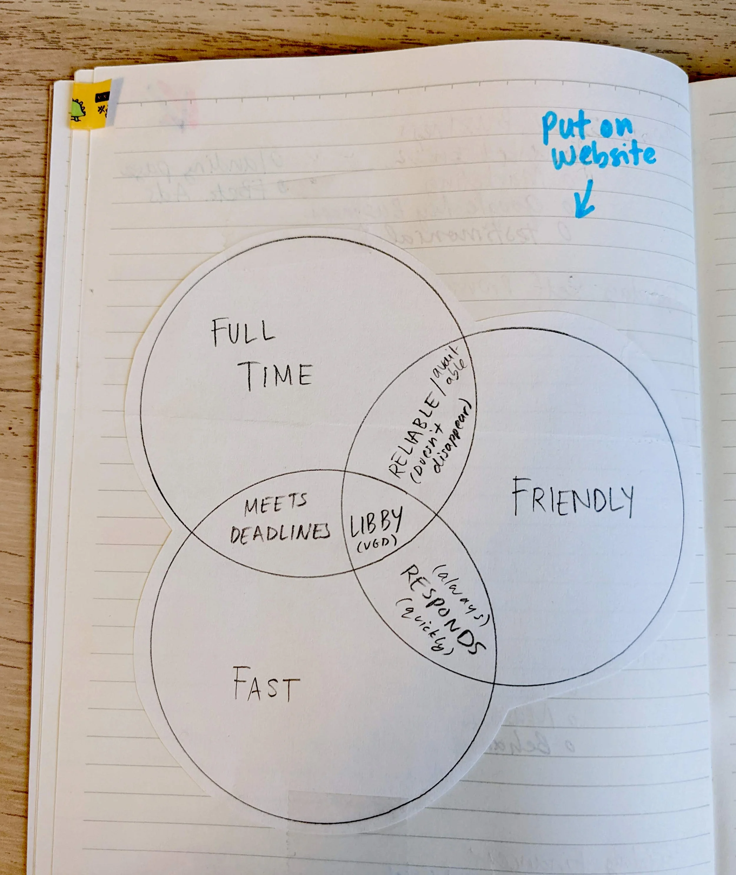
I was looking through an old notebook and found a Venn diagram I made for Ventura Graphic Design back in 2019, with a note that says, “Put on website,” next to it.
Better late than never?
It speaks to—but is different from—the very zeitgeisty notion that applies to many services: You can either get things cheap and quick but not good, good and cheap but not quick, or good and quick but not cheap.
And that’s the way it should be, right? For Ventura Graphic Design, I like to think, “I am always good, often quick, and very reasonable.”
Here’s my Venn diagram that shows what sets me apart from other freelancers.

My Top 3 Work and Life Organizing Hacks
Read on to learn about my top three organizing systems. These things help keep my life running smoothly and my stress-levels low.
Weekly To-Do Sheets

My sloppy attempt at bullet journaling…
Throughout my years of running Ventura Graphic Design, I’ve gone through a few different to-do list systems. When I started out, I had a notebook with no structure or organization to it at all. I moved on to some online list managers (TeuxDeux and Wunderlist). Then I made a big swerve back to analog in 2018 when I discovered bullet journaling… which quickly became too much work and devolved into something much less appealing.

… and what it became.
So, I found a better way. I’ve been using my new system for a year now and I think it’s going to stick. I designed a weekly to-do sheet that has customized sections for exactly what I need.
Like many of you, my work and personal lives are closely intertwined. I needed a system that I could keep track of both—so I’ve got separate sections for my work to-do’s and my personal to-do’s. There’s a small section at the top where I write any scheduled meetings or events for each day.

When the week is over, I use a two-hole punch and add that page to a binder. Everything is in order and clearly dated so I can go back and find things easily. Any extra pages of notes also go in there chronologically.

My weekly to-do sheet!
I owe a lot of credit to Crystal Reynolds for this idea. She designed a planner (you can buy it here!) which strongly inspired the design of my weekly to-do list.

Labels in Gmail
I like to keep a clean inbox. There is nothing more overwhelming than having to scroll down through hundreds of emails.
My inbox functions as a sort-of second to-do list and the most important part of keeping it organized is using labels (read how here).
As soon as I’ve read a new email, I add a client label to it. You’re all there—color coded to match your brand! This makes it much easier to see immediately what is in my inbox and needs attention.
If I’ve replied to the email and finished whatever task was associated with it, I archive the email which—since it was labeled—goes right into that client’s folder. What remains in my colorful inbox are only things that need my attention—which makes writing my analog to-do list very easy.
Multiple Calendars

Another main tool I use for organization is Google Calendar. Seriously, the calendar is one of the best parts of an online life. In addition to the obvious—meetings, birthdays, school events—I use the calendar to help myself get things done.
Being able to create different calendars—all color coded—is key. My schedule for this blog has its own calendar—telling me when I should start working on it and when to post it. Frankly, it wouldn’t get done otherwise.
By far my favorite thing I use Google Calendar for is a personal life item—my Master Recipe Calendar!
I used to hate when I found a great new recipe—and then forgot all about it and never made it again. Now, when I find a make-again-worthy recipe, I add it to my recipe calendar on the date I made it, set it to repeat annually, and paste the link to the recipe in the description or note what cookbook it’s in. When I plan my recipes for the week, I just look at the calendar. Everything is seasonally appropriate, and I know we all like it. My son has started telling me to “add it to the calendar!” or, naturally, “don’t put this one on the calendar…”

December is mostly cookies!
What are your favorite organization hacks? Is there anything you couldn’t live without?
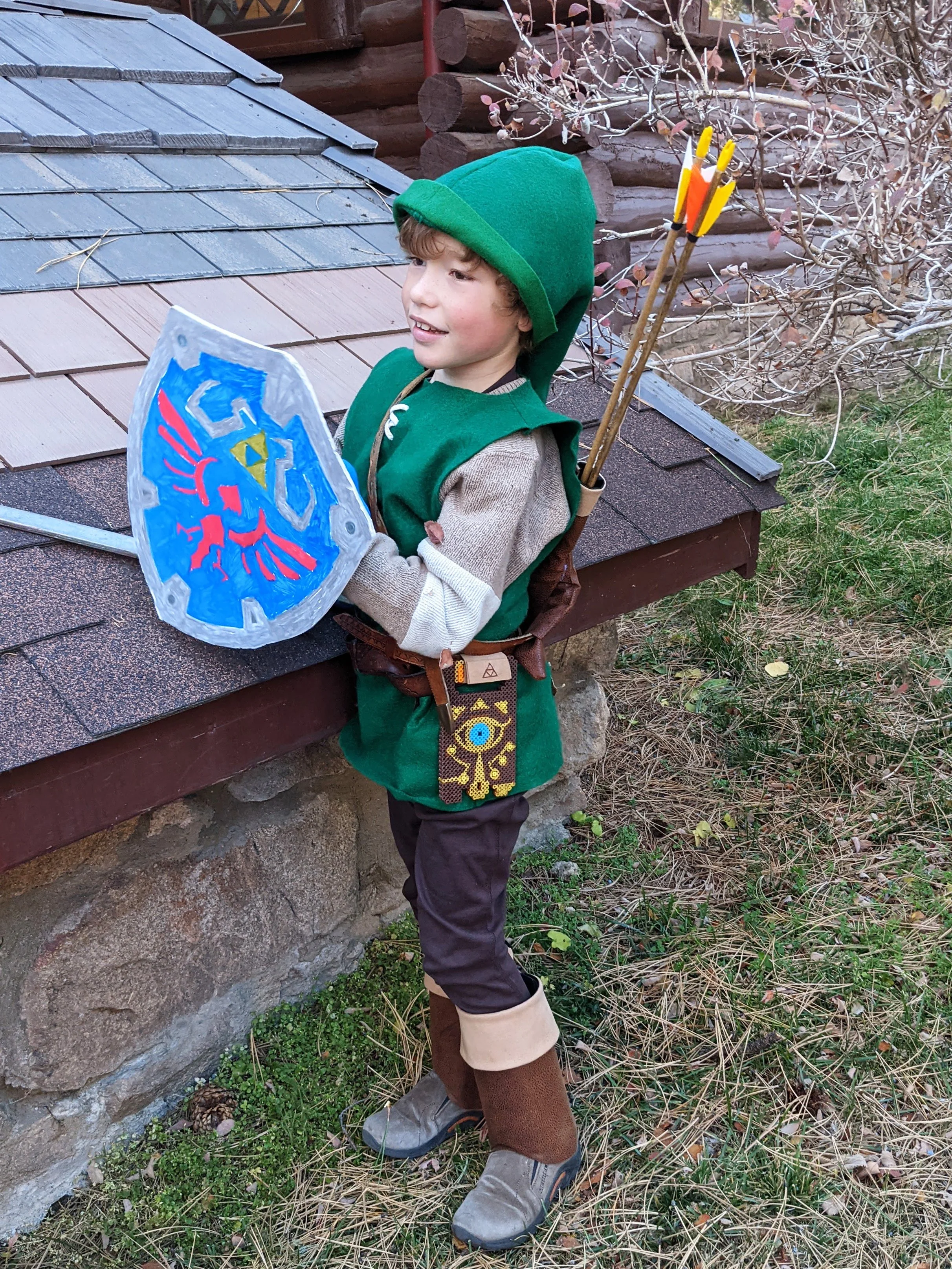
Halloween Costume Creativity 🎃


One of my favorite things about being a parent is getting to make Halloween costumes. This year my son wanted to be Link from The Legend of Zelda: Breath of the Wild. (For those of you not familiar with this video game, give me a call and I'll let him tell you all about it!)
As you know, I love a creative challenge, so I was all about making this costume as authentic as possible. He already had the sword... and the bow and arrows... and the shield (which we just put a false front on to match the Hylian Shield).
The tunic and hat came together quickly from a big piece of green felt. I collected some old belts and punched new holes in them to fit, added a pouch to carry his Rupees, and a quiver to hold his arrows.
The Sheikah Slate—Link's tablet—essential for navigating the kingdom of Hyrule—also had to be connected to his belt. I made it out of Perler beads (those ones you put in a pattern and then iron to melt together). Finally, I added some boot cuffs made from poster board covered in faux leather.
And he's off, into the night! Beware any bokoblins or lynels that dare cross his path.
Now that this project is done, I've got some time for new ones! Let me know what you've got coming up that I might be able to help you out with.
And please share your Halloween costume pics with me! Already looking for inspiration for next year.
Happy Halloween!

A Summer Tradition—The Renaissance Festival

One of our favorite things to do in the summer is go to the Renaissance Festival. I never went growing up, and my mind was blown the first time we went 4 years ago. It was one of the most frequent things Miles asked about last summer that we couldn’t do because of quarantine. Luckily, we were able to go this summer! Huzzah! Here are a few of our favorite things about it, and—yes—how they relate to Ventura Graphic Design.
Dedication to the Cause

One of the most dedicated… and disturbing
I’d love to tell you that my whole family gets fully dressed up in Renaissance garb for the event, but alas we do not. Joe even got heckled at the entrance for looking like every other “white dad” who had come in that day. But I’d say more than half of the people do dress up, and of course all the people who work there are fully dedicated to the theme—from their costumes to the way they speak. They put their hearts into it, and they have fun with it. You could say the same about the work I do for you.
People-Powered

Grandpa, Miles and me on the King’s Swing
Did you know that the Renaissance Festival has rides? And that all these rides are people-powered? Not one engine in sight! Our favorite is the King’s Swing. It’s basically a giant swing that two people pull back ridiculously far (it’s pretty scary) and then let you go swinging amid the trees while also trying to knock your shoes off (Miles made sure none of us were wearing flip flops when we left the house). Ok, this doesn’t really relate to my business, but the King’s Swing is Miles and my favorite part of the whole Festival, so I had to mention it!
Experience and Training

Cy the Sword Swallower
In addition to food, games, and rides, the Renaissance Festival is known for its shows. Our favorite this year was the sword swallower. He showed us amateur collapsible swords and proved to us that he was swallowing the Real Thing. He even swallowed a curved sword by perfectly curving his body to fit to it—yikes! (Watch it here—not for the faint of heart!) Well, you don’t get to be a professional—and living—sword swallower without a lot of practice and consistent training. You can see where this is going! I’ve been running this business for 9 years and continue to learn new things all the time.
When Efficiency Goes Wrong

A sea of people
I blame this on having missed the festival last year—out of practice!—but we made a total rookie mistake this year. We didn’t bring cash! And the line to the ATM was past the privies and 2 turkey leg stands. This is an example of inefficiency due to being ill prepared. Luckily, my years of experience with graphic design mean that I never do this in my own work. I am all about finding the most efficient way to work with you—to benefit us both!
If you are fortunate enough to live near a Renaissance Festival, and have never been, get thee to the Faire!
New Year, New Logo
(Am I the only who feels like 2021 just started?)
Like many business owners, I’ve found it necessary from time to time to follow the maxim, “Better Done Than Perfect.” It can be a hard lesson for a perfectionist to learn.
Nine years ago, when I was balancing a full-time job with my side-hustle (as it would be called today!) I needed a website, business cards, designs for proposals and invoices… and to make all of that happen, I needed a logo. Enter my first lesson in “Better Done Than Perfect.”
The logo I designed then has served me well and—I hope—wouldn’t bother your average Joe. (I don’t think Joe was ever bothered by it!) But as I’ve looked at it over time, more and more things stood out to me that I wanted to change. Mostly nitpicky typographical things. That plus the desire for something new—and of course the time to do it!—has led me to my own rebranding project. And this time it’s not only done—it’s also perfect.
If you’re curious about the ins and outs of this project—what bugged me about the old one and how I fixed it—please keep reading.

My original logo marked up with what I wanted to change.
The first curve on the V is oddly squared off in the original. I smoothed it out to make a more natural curve.
In brush typography like this, and in traditional calligraphy, the upstrokes are thin and the downstrokes are thick. The transitions between the down and upstrokes on my letters were awkward and went too thin too quickly.
The r was a perfect opportunity to add a little bit of flair to the logo—an opportunity I missed in the first round. While you generally want all of your letters to be the same height, the loop in the lowercase r is a perfect chance to break out of that zone and add some dynamism.
The crossbar on the t was also a missed opportunity in my first design. Mirroring its relationship to the V and r in the new design ties everything together and gives it a reason for being there. My original crossbar had no meaning, it was just shaped and positioned that way because I thought it looked nice, now it completes the logo.
Why was the original logo angled? I didn’t have a reason for it, so I nixed it.
The e has always bothered me the most about the original logo. It was never right, and it sticks out like a sore thumb. This put some undue pressure on the new e and I tried a number of variations for it before settling on this one. I’m still not sure…
I’ve always liked the colors of my logo, but I was ready for something bolder. Turquoise is still my favorite color, so why not stick with that? Okay, I’ve given the exact opposite advice to my clients before (it’s not about what you like, it’s about what will work the best for your company)—but in this case I like to think it satisfies both.

Three different es I tried for the new logo.

My initial sketch of the new logo.
The final redesign!
The Mighty Em Dash


Let’s talk about one of my good friends—the em dash. That super long hyphen who pops up in all sorts of content these days—deservedly! Often replaced with the much lesser double hyphen--not cool.
And what about the mysterious en dash—what in the heck is she for? All those answers—and more—below.
The Em Dash
The em dash—oh so versatile—is a lovely replacement for almost any other type of punctuation! It can replace commas, parenthesis, colons, ellipses—who knows what else.
The em dash is long—long like the letter “m”. The en dash is shorter—shorter like the letter “n”. But none so short as the meager hyphen—a speck between compound words.
Should the em dash — when used correctly — be surrounded by spaces? My opinion—fwiw— is that it depends on the font you’re using. Some need it and some don’t—go with your gut.
So—how do you type it?
On a mac—easy peasy—press Option+Shift+Hyphen.
On a PC—not as easy. The internet tells me Alt+0151—but I have no way of testing this. PC users—this blog post goes into some more detail for you.
Also—Word will autocorrect a double hyphen to an em dash—which is nice.
The En Dash
Much less common—and with a much more specific use—is the en dash. The en dash is used almost exclusively with numerals to show a range—for example, K–12, ages 6–8, from November 6–12—you get the idea.
To type it—on a mac—press Option+Hyphen.
PC—Alt+0150.
Bonus
Here are a few of my other favorite keyboard shortcuts on a mac—sorry PCers!—for some lesser-used marks:
Bullet Point: Option+8 •
Copyright Symbol: Option+G ©
Cent sign: Option+4 ¢
Ellipses: Option+Colon …
Disclaimer—not all of the em dashes in this article have been used correctly—for the sake of comedic overkill.
Are we allowed to talk about this?
The six-year-old elephant in the room

It’s been a juggling act around here lately. I have a six-year-old son and I have a design business to run. Very occasionally, I’ll mention my son to a client… the struggle of childcare and balancing remote school and work. But for the most part I feel like I need to keep it secret.
Our school district just announced that the first two weeks of school will be remote. And I’m sure that won’t be the end of it. Work has slowed down because of this pandemic and I’m torn between being beyond ready for my business to bounce back, and knowing that when it does, I’ll be stressed to the max. I know EVERYONE is dealing with this. But am I allowed to talk to you, my lovely clients, about it?
I think I should be. I think we should be talking about it.
Am I allowed to say, “This is great week for your project because I actually have childcare!” Or, “I think I can rope the grandparents into a few extra hours today to get that done!” Do I have to hide it? Will it make you think of me as less of a businessperson if I’m also juggling a six-year-old?
If this is my reality, I don’t think I should have to hide behind other excuses. It’s the kid! I’ve got three hours today of peace and quiet and they are ALL YOURS! But after that it’s going to be tough. So, let’s just say it.
I was on my monthly accountability call recently and a colleague admitted that it was great to hear that he wasn’t the only one dealing with childcare issues. That he has been trying to hide that fact from his clients and he felt alone in it. Even on these accountability calls, a safe space, he had not felt comfortable sharing his true struggle—having a two-year-old!
It is something so many of us are dealing with but we’re not talking to each other about.
Will this note make you more or less inclined to send me work? I’d say neither is my goal. My purpose is just to reach out and say hey, I’m still here. I’m working when I can, getting things done before everyone else is awake, and, like all of you, taking it one day at a time.
Do you have an elephant in the room? Don’t feel like you have to hide it from me.
Top 5 Websites for (mostly) FREE Icons and Photos

Icons
If You only use a few icons a year and they don’t have to be perfect
On IconFinder.com you can filter your results to only show Free icons with “No Link Back.” There won’t be a ton of choices, but there should be some for whatever you’re looking for.
If You only use a few icons a year but they need to be perfect
The paid icons on IconFinder.com only cost about $2 each. They also have a pretty good icon editing tool in which you can change the color and add or delete certain elements.
You use more than 20 icons a year.
My icon shop of choice is TheNounProject.com. For only $40/year you can download as many icons as you want and use them any way you want—without attribution. You can also customize the color of the icons on the site, but there is not much built-in editing beyond that.
Photos
Largest selection
Two of the biggest free image sites, Pixabay and Pexels, were bought by Canva this year. So, you can just search Canva.com/photos and filter by Free to see everything available.
High quality with hipster vibe
Quirkiest
What makes a good stock image:
No cheese
Based in reality
Looks like the people you serve
What’s the deal with attribution?
A lot of icons and images you find on various sites look like they’re free at first, but then you find that you have to credit the author. And sure, there’s virtually no way for them to know if you do that, but you should because you’re a good person. The better option is to find free icons and images that don’t ask for attribution.
Pro Tip: If you don’t want to pay for an icon, make sure it says, “Free for commercial use” or “No Link Back.”
Pro Tip: On IconFinder.com you can also filter by type of icon—solid black (glyph), outline, filled outline, etc.
Pro Tip: If you need to find an icon for a more abstract concept, try searching first on google for “your abstract concept icon.” That will give you some ideas of what other people are using to illustrate the point. Then take that more specific noun (hopefully!) and search for it on the icon site.
Pro Tip: If you use a lot of stock images and don’t mind paying, Canva also has a new unlimited download subscription for only $13/month. If you only need a few per year, the standard images at sites like iStock.com only cost about $11 each.
How to give your designer great feedback
Giving feedback to a designer seems simple enough, but there are certain things that can really change the course of a project from rough to smooth sailing. Here are three examples of not-great feedback… and how they could have been better.
FEEDBACK EXAMPLE 1:
We don’t like the graphic on page 2.
Try to be specific about what you do or don’t like, without being prescriptive.
TRY THIS INSTEAD:
For the graphic on page 2, we like the style and layout, but the icons for the three items don’t represent them well enough. Can you take another stab at it?
FEEDBACK EXAMPLE 2:
The page is looking too busy. Please move the blue box to the top, change the font size of the green callout, move the picture to the right, and switch all the text to be one column.
Never feel like you have to come up with the solution if something isn’t working. That’s my job—and I’m happy to do it.
TRY THIS INSTEAD:
The page is looking too busy. Can you find a way to make it look less cluttered? Let us know if we need to cut some copy.
FEEDBACK EXAMPLE 3:
We love it! (*secretly thinking: this isn’t what I expected at all and I’m not sure why we’re paying for it and we’ll never work with her again*)
Don’t tell me what you think I want to hear. Please don’t worry about hurting your designer’s feelings. Honest feedback is the only way to ensure that the project is a success.
TRY THIS INSTEAD:
This really isn’t what we expected at all. Can we schedule a call to talk over what isn’t working?
Other useful tips
If you’re working with a team, designate one person to communicate with your designer. Combine all of your edits and send them in one email. Not only is this easier for me, it also makes it less likely that there will be conflicting feedback or that something will fall through the cracks.
Don’t be afraid to ask why. Sometimes you might wonder about a choice I made. I guarantee there was a good reason for it!
Don’t like pink? It doesn’t really matter… If your target audience likes it, then that’s what we should use. Try to keep your personal preferences out of the design process.
Bonus: How to make comments in Adobe Acrobat
My preferred way to receive feedback is with comments in Acrobat. Here’s how.
How to make comments in Adobe Acrobat
These instructions are for Adobe Acrobat Reader DC, the current version as of September 2019. If you’re working with an older version of Reader see here. If you’re lucky enough to work with Adobe Acrobat Pro DC, these instructions will work for you as well.
The Comment feature in the new version of Acrobat has way more tools than you’ll ever need. Let’s keep things simple—you really only need two.
Click to enlarge.
First, open up the Comment sidebar. To the right of your PDF, you should see the Tools Pane—you’ll see “Comment” with its yellow icon. (If you don’t see the Tools Pane, in the top menu, click View / Show/Hide and make sure Tools Pane is checked.)
Clicking on Comment gives you the full Comment toolbar, now at the top of your screen. Conveniently, the two most useful tools are the first two: Add Sticky Note and Highlight Text.
Click to enlarge.
Add Sticky Note
Just click on this icon and then click anywhere on your PDF to leave a note.
Great for feedback on the whole page or general comments not specific to one item.
Great for comments on images, icons, or other graphics.
Not great for text edits.
Click to enlarge.
Highlight text
Click on this tool and then click and drag over text to highlight it. If your Comment sidebar is still open, your cursor will jump to it and you can type your comment.
Great for editing text. No need to write “please change to” or “delete and replace with…” Simply write what the highlighted text should now read.
When you’re done, just make sure you save your marked-up PDF with a new name (maybe add your initials, or the word “edits”) and send it back to your designer!
New Website for a Fresh Start
Things have been a little quiet over here at Ventura Graphic Design. But not so quiet in the Ventura household! Since my last blog post there have been two cross-country moves and the addition of a very important little boy—who is now almost three! Now that we're settled in our new (forever?) home, and the boy can pretty much take care of himself (!) it's time to give VGD some TLC.
Starting with a fresh new website! Oh, how I love Squarespace. They make such great looking sites but I can still make it totally my own by adding a smattering of code here and there.
I also have a sunny new office in our new home in Evergreen, Colorado. It's great to have a dedicated space to retreat to. And great to be surrounded by such beauty everyday.
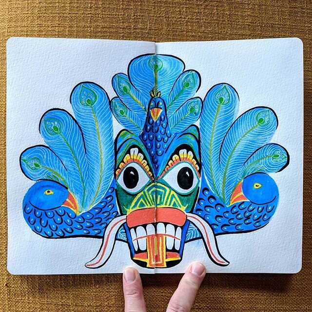
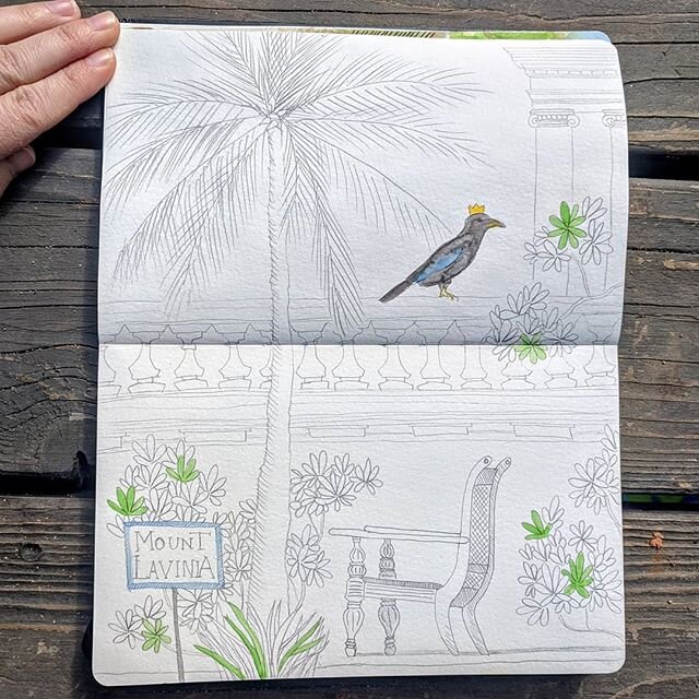
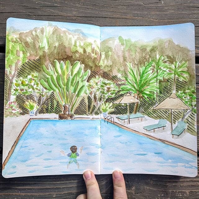
Finally, I've decided to give my creativity a kick-start by joining #the100dayproject. Watch my journey on Instagram! I'm focusing on illustration and a goal for this year is to incorporate some of my original drawings or hand lettering into a graphic design project!


Make your Graphic Designer Love You with Comments in Acrobat
When your graphic designer gives you a PDF of your brand new design, chances are you’re going to need to request some edits to be made. They could be repositioning, color changes, or, most frequently, copy edits. I’ve gotten edits in all sorts of ways from clients, photos of pen-marked print outs, extensive lists by email, voicemails… but the ideal way of receiving edits is a PDF with comments.
What is a Vector Image?
Digital images can be broken down into two categories: Vector and Raster. What’s the difference?