Design and communication insights for nonprofits that want to make a real impact.
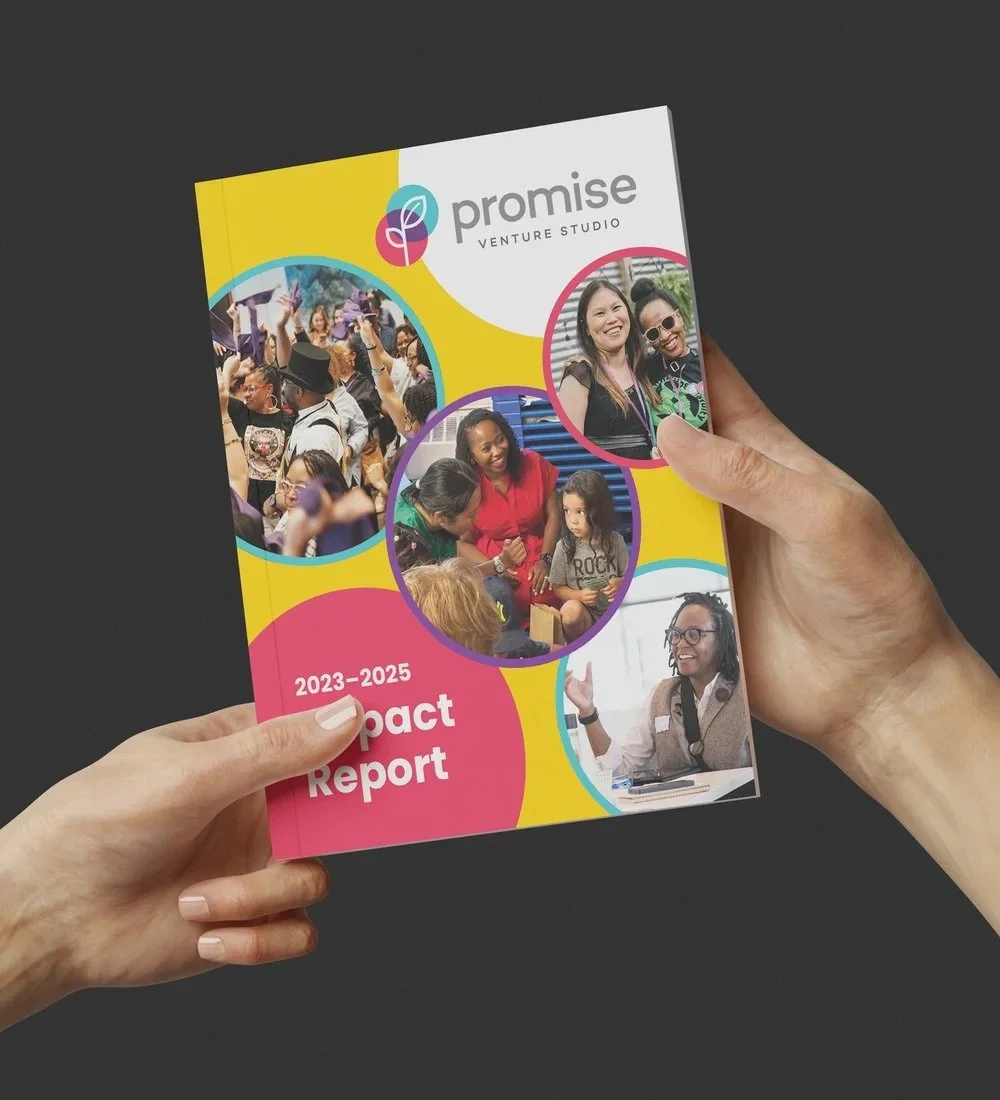
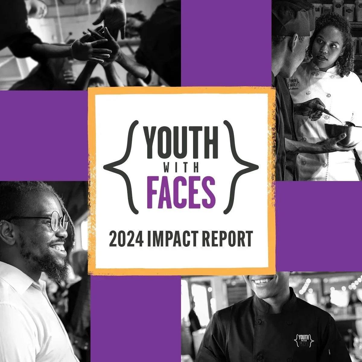
Impact and Annual Reports
Featured

Nonprofit Design Tips
Featured


Beyond the Work
Featured