The Biggest Graphic Design Mistake Non-Designers Make
What’s the most common graphic design mistake nonprofits make — and how can avoiding it improve your materials?
When nonprofit teams without formal design training create their own visuals or documents, one mistake stands out above the rest: disregarding proper margins. Trying to pack too much content onto a page often leads to cluttered, hard-to-read materials that look amateurish. This post explains why consistent margins matter, when it’s okay to break that rule, and simple steps your organization can take to make your designs look more professional and easier for your audience to engage with.
It’s all about the margins!
I know! You’ve got so much content. And you’re trying to fit it all on one page. And the font can’t be too small. And you’ve got to include this photo. And you’ve got to have this graphic so it’s not just all text. But how is it all going to fit? We’ve got to fill the entire page!
And you can use the whole page. I’m not here to lecture you about white space! Just give it a half inch on each side. That’s all you need! Small margins are just fine (but no smaller than half an inch please).
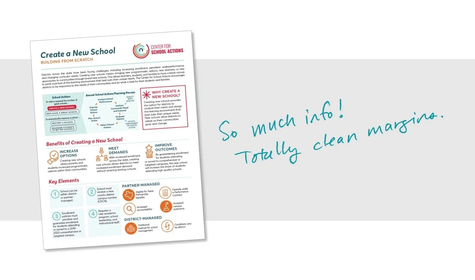
Listen—nothing can go in that half inch. Keep it clean! And your document will look like it was done by a pro.
Yes, there are a few exceptions (aren’t there always?). These things are totally fine to be in the margin:
Photos that bleed (go all the way to the edge).
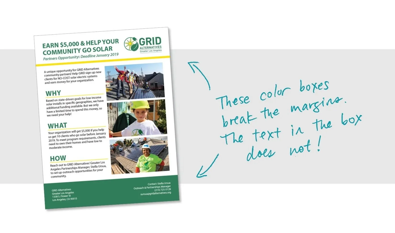
Boxes of color that bleed—but nothing IN the box should go into the margin!
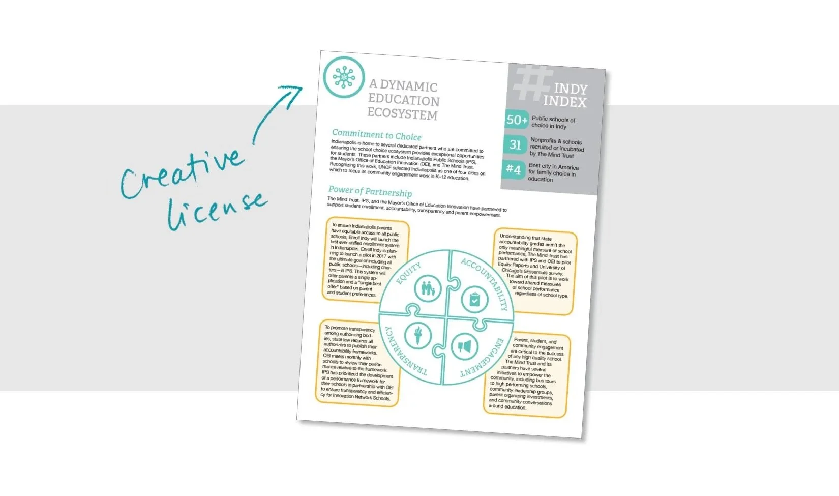
Minimal “creative license” items
If you feel like you have plenty of room, then increase your margins—go for ¾” or even a full inch. Just make them consistent and line everything up.
If you’ve got too much text, first try to cut it, and then… well, there are some tricks I know to get text to fit—but we’ll save those for another day.
Happy designing!
FAQs
-
The biggest mistake nonprofits and other non-designers often make is trying to fill every inch of a document with content instead of leaving proper margins, which results in designs that feel crowded and unprofessional.
-
Margins provide visual breathing room that helps readers focus on your content. Consistent space around the edges makes materials look cleaner, more readable, and better organized — which helps your audience absorb your message.
-
A good starting point is at least a half-inch margin on all sides of your document, and you can increase to ¾-inch or even a full inch if you have space — just keep the spacing consistent throughout.
-
Yes — photos or color blocks that “bleed” all the way to the edge are acceptable, but nothing important (like text or key graphics) should sit within the margin itself.